


51 faces divided into 3 curated categories, each serving a different purpose and user mood.

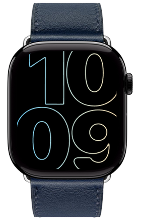
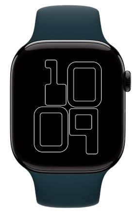
The Eclipse
Eclipse is a modular Apple Watch face designed with expressive typography and spatial minimalism in mind. Built using Adobe Illustrator and Figma, this concept blends circular and rounded geometric forms to reinterpret the default “10:09” Apple time.


SOLID FILL
SOFT FILL
OUTLINE

Midnight Silver
Clean, neutral grayscale with high contrast for daily minimalism.

Gold Dust
Subtle luxury with a warm, earthy glow.

Rose Carbon
A blend of deep blush and charcoal elegance.

Moon Violet
Calm, mysterious purple tones inspired by twilight.

Neon Blue
Bold, cool-toned digital edge with futuristic energy.
Exploring modular variations of form, color, and function through typographic minimalism.


WATCH
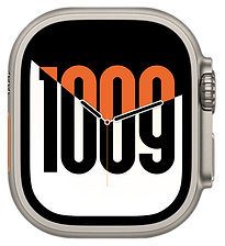
Nike Series
A set of six dynamic Apple Watch faces inspired by Nike’s performance driven brand identity. Designed using vibrant color gradients, bold typography, and athletic iconography, these faces channel motion, energy, and sport into a wearable format.
Each layout pushes clarity, legibility, and visual rhythm making them ideal for users who live in motion.


Nike Motion Series
Nike Swoosh Split
Nike Motion Series Complications
A bold Nike inspired set of four watch faces that fuse motion, clarity, and energy.
Featuring vibrant gradients, stretched outlines, and the iconic swoosh, each face reflects a different side of athletic identity.
From dynamic color shifts to oversized type and quick-access fitness icons these designs are built for movement.

Sprint Gradient
Vibrant color shift from lime to peach with clean rounded digits and
quick access fitness icons.

Swoosh Outline
A lightweight outlined version with an oversized white Nike swoosh cutting through the center striking and iconic.

Solid Fill Bold
A bold watch face with fully filled, oversized digits, centered Nike logo and clean layout make it perfect for active, on-the-move users.

Stretch Type Outline
Elongated outlined typography dominating the screen, topped with the Nike logo for an intense athletic vibe.
Nike Swoosh Split Complications
Swoosh Split is a bold set of analog Apple Watch faces featuring dynamic diagonal cuts, oversized digits, and the iconic Nike energy.
With sharp contrast and motion-inspired layout, these designs reimagine time through rhythm, speed, and visual impact.


Burn Mode
Bold orange dominates the screen with a sharp diagonal cut slicing into black.
A powerful, performance-driven face built to energize your every move.
Flip Focus
With white leading into black and warm orange highlights, this face balances strength and style.
Perfect for users who like contrast with a touch of sleek attitude.
Heat Shift
Orange rises from a deep black base with crisp white digits creating clean separation.
This face captures the pulse of momentum calm on top, fire beneath.
Clean Strike
Minimal white background meets strong orange diagonals and black digits.
Designed for clarity, focus, and a modern athletic edge.

Everyday Watch Faces
Designed for daily use, this set of 29 faces explores how layout, typography, and color can transform functional design into something beautiful. Whether minimal, expressive, or retro-inspired, each face brings clarity and style to your wrist.
Oversized Numerals Series
A bold typographic approach that brings large, overlapping numerals to the forefront. This series explores legibility, layering, and hierarchy through different styles from delicate outlines to high-contrast fills all while keeping the watch hands clean and centered.


Muted Layered Fill
Full Numeric Bold
Complete Circle Outline


Shadowed Depth
Flat Fill Pop
Outline Play
Gradient Max
This set explores oversized typographic forms of the number “10,” filled or outlined with vibrant gradients. It emphasizes digital expressiveness, scale, and motion blending minimalist structure with high-impact color.

Full Spectrum Bold

Striped Fade

Spectrum Wire
Modular Blocks
A modular typographic watch face inspired by pixel grids and retro display aesthetics. The time is represented in bold, block-style digits with a playful square geometry, balancing structure with simplicity.

Modular Solid

Modular Hybrid

Modular Outline
Apple Core
This playful concept embeds dynamic numerical typography within the iconic Apple logo silhouette. The design balances whimsy and boldness, giving the illusion of time molded into Apple’s brand form perfect for Apple fans who want something fun and expressive.

Color Pop

Gradient Fill

Line Art
Modular Infographic Orbit
A data-driven, circular modular interface that combines world time, weather metrics, fitness rings, and compass data, all wrapped in an interactive globe-based layout. It balances both utility and sleek visual complexity.

Analog Style

Digital Time
Hawaiian Bloom
A vibrant and cheerful collection inspired by the lush floral beauty of Hawaiian islands. These watch faces bring tropical charm to your wrist with bold colors and playful flower forms arranged in both analog and typographic styles.

Hawaiian Bloom Analog

Hawaiian Bloom Digital

Hawaiian Bloom Hourly
Aurora Luxe
This watch face explores bold, expressive typography with a luxurious aurora-inspired gradient. The oversized, elegant numerals are designed with dramatic geometric slants and curves, making time feel both stylish and futuristic. The design strikes a balance between fashion and tech, offering versions in gradient fill, sleek outline, and high-contrast white.

Gradient Fill

Gradient Outline

Inverted Glow
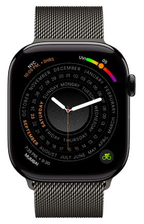
ChronoScope
This set transforms the Apple Watch face into a radial time intelligence dashboard, merging analog and digital formats. It seamlessly visualizes day, date, month, week, UV index, city-based dual time zones, compass direction, and even hourly weather forecast all orbiting around a central timekeeping element. The design celebrates the power of structured information while keeping the experience visually clean and modern.

Multi Information Digital Edition

Orbit Edition
Morning Mist
This watch face uses bold, oversized numerals with a soft sunrise-inspired gradient transitioning from cool blue to warm beige. It embraces clarity and simplicity while maintaining a vibrant, optimistic feel perfect for starting the day on a bright note.
The minimal design places typography front and center, ideal for users who want a clean, energetic, and legible display.

Solid

Outline

Inverse

Conclusion!
This project helped me become a more thoughtful and precise designer. Working within the Apple Watch’s space and UI constraints sharpened my skills in layout, spacing, and hierarchy. It taught me how to balance expressive visuals with functional needs a skill that’s important in all areas of digital design. I received positive feedback from peers, mentors, and even strangers online, especially for the way I used typography creatively. It sparked conversations about wearable design and how visuals can shape our daily habits. The process also improved my confidence in using Figma and Illustrator to create clean, adaptable assets.I now use this project as a strong portfolio piece when talking about visual storytelling and design thinking. Most importantly, it reminded me that good design isn’t just about beauty, it’s about how it makes people feel and interact with the world.