ABOUT
Odonil is a well-known air freshener brand in India, trusted for its long-lasting fragrances. However, its identity felt outdated in a market increasingly driven by lifestyle aesthetics andeco-conscious choices. The goal was to repackage Odonil as a modern, nature-inspired brand that appeals to a younger audience, while staying rooted in freshness and familiarity.

VISUAL IDENTITY
The logotype is modern and airy, paired with a symbolic droplet icon. Colors were chosen to match each fragrance’s mood. Lavender for calm, ocean blue for clarity, citrus yellow for energy
PACKAGING DESIGN
Each pack features a subtle fragrance-inspired pattern, a central droplet image, and eco-friendly visual cues. The layout is minimal yet vibrant, designed to stand out in both supermarkets and online stores.
Packaging Design
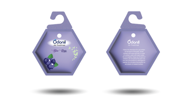
As part of the packaging, I introduced a unique hexagon-shaped packaging to break away from the traditional rectangular box design. The hexagon symbolizes harmony and balance, mirroring the way fragrance brings balance to one’s space.
This geometric form isn’t just visually distinctive. It also enhances shelf presence, making the product more noticeable in retail environments. The angled edges offer natural segmentation for key information like fragrance type, freshness duration, and eco-certifications, creating a structured yet elegant layout.
Additionally, the compact, interlocking form of the hexagon supports eco-friendly stacking and reduces packaging waste, aligning with Odonil’s nature-inspired positioning.
Visual Illustrations


Development
Brand Strategy & Research:
I began by researching Odonil’s competitors and analyzing customer preferences around fragrance, packaging, and lifestyle cues. The insight: today’s consumers don’t just want a product that masks odor. They want a fresh experience that feels clean, natural, and premium.
Concept Development:
I explored design directions inspired by nature—dew drops, blooming petals, and waves of freshness. The core concept emerged as “A Breath of Nature,” focused on turning everyday spaces into calming, refreshing corners.
Design Exploration:
The logo was softened, the color palette shifted toward botanical hues, and the packaging was redesigned with smooth gradients, clean typography, and a flowing droplet motif to reinforce the core idea of purity and freshness.
Execution:
I created a full packaging designs for multiple fragrance variants, ready mockups, and digital assets for social media.
Conclusion!
Since the launch of Godrej’s “aer pocket,” competing brands like Odonil, Air Wick, and Ambi Pur have experienced a noticeable dip in perceived brand value and market presence. To explore how thoughtful design can revive and reposition such brands, I chose Odonil as the focus of this rebranding project. The goal was to elevate its identity, making it more relatable to today’s lifestyle-conscious consumers while maintaining its legacy as a trusted air freshener brand. The Odonil rebranding project blends functional elegance with sensory storytelling. By aligning visual elements with the emotional appeal of each fragrance, this design not only revitalizes shelf presence but also creates a stronger emotional bond with consumers. Through thoughtful packaging, color psychology, and lifestyle-driven mockups, the brand is reimagined to fit modern households while retaining its legacy. This project demonstrates how strategic design can elevate everyday products into memorable, delightful experiences.


